What's In A Label?


What is it that makes a beer label so special? How does it make you feel when you see it on the shelf in a bottle shop? What is that brewery trying to communicate with you?
These are all the questions that we ask ourselves on some level when picking our favourite brands and beers. If you ask most drinkers why they love a particular beer or brewery they will with any likelihood tell you it's because they love the taste of that particular beer, or that the level of quality from that brewery sets it apart from the competition.
And this is certainly true, but as many chefs will tell you, you eat and drink with your eyes and the power of an eye catching label plays a larger part in what you drink than you may first think!
At Unity Brewing Co we have spent the last four and a half years tirelessly developing and improving our recipes in order to produce beers that are unifying, refreshing and ultimately satisfying. Another huge part of our process is to ensure that we present our beers in a way that is fun, approachable and in a way that encourages you to be part of our community of beer lovers.
We are pleased to say, that with this week's release of our latest generation of core range labels we can achieve this. Reflecting on the journey of our core range Founder and Head Brewer Jimmy Hatherley says: “I am so proud of the journey our business has taken over the past four years, and I have always strived to build upon and improve every aspect of the brewery - from our recipes, to the service in our taproom and of course how our beer is presented in the market. Matt Canning is an integral part of our team, and his work is key to communicating who we are as a company.”
Working with our long term collaborator Matt Canning we have refreshed, refined and redesigned the look of fan favourites Conflux Pale Ale, Collision IPA and Prinzen Lagerbier, bringing the design on the outside of the can in line with the quality of the beer on the inside.
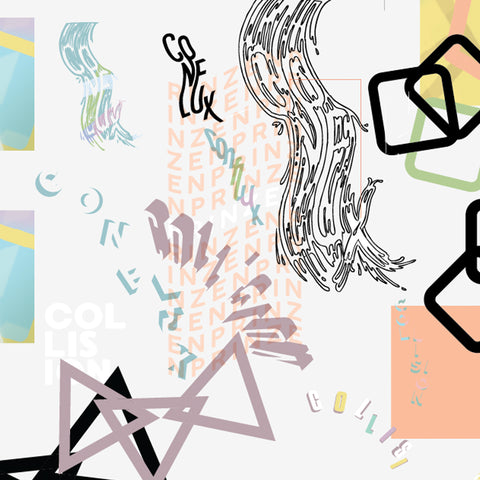
Matt had this to say about the new series of labels: “Continuing on from the soft 80s/90s nostalgic aesthetic we currently had for the core beers, we wanted to make the beer names part of the artwork rather than the artwork focus being just a background image with text overlaid - and importantly to really hone in what Unity is all about. I think what we've ended up with marries well with the can contents - soft, friendly and delicious!"

A real turning point for our design process came in the autumn of 2020 with the release of seasonal beers Ruska and Cosmic Ballet, building the names and styles of the beer into the image to create a wholesome, engaging and ultimately fun experience.
The unveiling of a new beer design is always an exciting time at the brewery, and one of the most rewarding parts of releasing a new beer is the fantastic feedback we always receive from our customers, followers and friends within the community - so with that in mind, here's to many more vibrant, fun and enjoyable labels in the future!


